

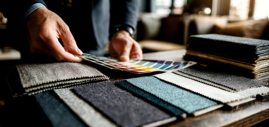
The Silent Salesman
Go to any high-end menswear store. Before the salesman comes to you, before you touch the Egyptian cotton or feel the weight of the wool blazer, something else is speaking to you. Color. In the world of advertising, color is often called the “silent seller” because it communicates value, emotion, and identity in a fraction of a second. For the modern male consumer, who often prides himself on logic and practicality, this is an incredible risk.
Research in the field of color psychology suggests that up to 90% of a snap decision about a product is based on color alone. In men’s clothing, this figure is even stronger. Unlike womenswear, where silhouette and texture often come first, menswear relies heavily on a stable palette of colors to convey strength, reliability, and status. Understanding how chromatic choices influence purchasing decisions is no longer just a designer’s art; it’s a solid science for salespeople.
This article breaks down the psychological mechanisms behind certain colors in men’s fashion, examines the shift in men’s color acceptance, and provides concrete insights for brands seeking to convert browsers into consumers.
Historical Monochrome: Why Men “Can’t” Wear Pink
To understand modern purchasing decisions, one must first acknowledge the historical cage of male color. For most of the 20th century, the menswear market was dominated by the “Big Four”: Navy, Charcoal, Black, and Khaki. These colors have dominated marketing campaigns because they indicate safety. A man buying a beach suit wasn’t making a fashion statement; he was investing in social harmony.
The reason for buying these legacy colors is risk aversion. Marketing data consistently shows that men are more likely to buy dark, neutral colors when buying high-ticket items (suits, coats, leather shoes) because these colors promise longevity. The consumer’s internal monologue is, “I won’t look back on this purchase in three years and I regret it.”
However, the last decade has shattered this idea. The rise of the “Peacock Revolution” 2.0, driven by streetwear and strong culture, has expanded the men’s wheel. Today, an advertiser’s ability to present “dangerous” colors (pale, bright red, pink) depends on framing those colors as signs of confidence there are signs of deviation.
The Emotional Spectrum: Charting the Male Consumer
When a man looks at a shirt or pants, his brain uses a quick analysis of benefits based on color. Here’s how certain colors influence buying behavior.
1. Blue: The Trust Algorithm
Blue is the undisputed king of menswear marketing. It accounts for over 50% of all sales of suits and denim worldwide. But why?
- Psychological Trigger: Stability, wisdom, and calmness.
- Marketing Application: Blue lowers the consumer’s heart rate and reduces perceived risk. When a brand introduces a new product line, leading with the option of “French Blue” or “Navy” converts reluctant buyers. Color tells the consumer that, “He’s honest. He’s talented.” For online commerce, using blue as the main product icon increases click-through rates by about 15% compared to black, as it captures better in natural light and increases accessibility.
2. Darkness: The Paradox of Power and Invisibility
Black is the uniform of the creative and minimalist class. However, its purchasing power is controversial.
- Psychological Trigger: Power, complexity, but also stealth.
- Marketing Application: Black sells best to two different segments: the executive (buying a tuxedo or leather jacket) and the vulnerable consumer (buying black to avoid the “wrong” choice). Advertisers often use black for “capsule collections.” The phrase “Everybody needs a little black dress” has a feminine: “Everybody needs a black watch/jacket/shoe.” The buying decision here is driven by the fear of missing out (FOMO) on a universal basis.
3. Green: The New Neutral
Olive, Forest, and Sage burst into menswear for the street and workplace. Green is currently the fastest growing color segment in men’s accessories.
- Psychological Trigger: Growth, outside, authenticity.
- Marketing Application: As men’s lifestyles shift towards wellness and sustainability, green serves as a visual representation of these values. A man is more likely to buy a green parka than a blue one if the product description includes “heritage” or “adventure.” The starting point for shopping is nostalgia—an irrational desire to return to nature.
4. Red and Yellow: The High-Risk, High-Reward Spectrum
These are meaningless colors. It is not uncommon to see a man planning to buy a red blazer; he just buys it immediately or leaves.
- Psychological Trigger: Anger, excitement, warning.
- Marketing Application: Red is the color of clearance sales for a reason—it raises the heart rate and creates urgency. However, in premium menswear, red is reserved for “hero pieces” (sneakers, polo shirts). Advertisers use red to disrupt the neutral grid on the product listing page (PLP). If a consumer scrolls through 50 gray sweaters, one red sweater will take 78% of their visual attention. The purchase decision is an emotional one—the wearer wants to be seen as alpha.
The “Manference” Effect: How Content Changes Conversions
One of the most important lessons in menswear marketing is that men don’t buy colors; they buy the total.
A man will look at a salmon-pink shirt in a blank space and say no. This same man will buy that shirt when placed next to a navy blazer and gray pants on a mannequin holding a glass of whiskey. This is the result of “Manference” (Man + Reference).
- Color Anchoring: Men need to see how color works in social class. A pastel lavender polo is not a “feminine” color; “That’s what the guys at the Palm Beach Country club wear.”
- Tribal Symbols: For Gen Z and Millennial men, buying streetwear is about signaling tribal membership. A plain white (cream) hoodie sells better than a white hoodie because it reflects an old, historic fashion experience. The choice of color shows that the buyer is “in the know.”
Generational Shift: The Rise of the Destruction of “Chromophobia”
For decades marketers have treated men’s “chromophobia” (fear of color) as a fixed variable. However, data from NPD Group and WGSN (trend forecasting) show a big change.
- Boomers/Gen X: Choose colors with high chroma (royal blue, burgundy) as status symbols. They buy color to say, “I’m retired and on a cruise.”
- Millennials: Choose muted, dusty, or “dirty” colors (dusty rose, clay, mustard). They buy these colors to show confusion and disagreement. The trigger is true.
- Gen Z: Completely rejected the gender binary. For this demographic, buying a lavender hoodie or a lilac beanie isn’t a statement; it’s automatic. The trigger is fluidity.
In marketing, this means segmenting email campaigns by age group. Submitting a 55 year old lookbook with “acid yellow” will result in delisting. Sending a 22-year-old “heather gray” book will cause boredom. The color scheme must be demographically granular.
Practical Mechanics: Color the Buyer’s Journey
How exactly do you use this information to drive sales? Consider three stages of the shopping journey:
Section 1: Icon (Awareness)
On Instagram or in the seller’s grid, very different colors (white, red, yellow) stop scrolling. However, they have low conversion rates because they are intimidating. Smart DTC (Direct-to-Consumer) brands use a “Hero vs. Workhorse” strategy.
- Hero Color (Red/Yellow): Used for ads to drive traffic.
- Workhorse Color (Navy/Olive): Used for landing page to drive sales.
Section 2: Product Page (Consideration)
This is where “social proof of color” is important. Men are more influenced by “Most Popular Colors” labels. If a product marks “Stone” as a “Best Seller,” conversions to that color option increase by 40%. Men don’t want to make a mistake. They will look at the color swatches and choose the one with the most reviews.
Stage 3: Clothing Arrangement (Modification)
The final hurdle is “Does this go with my shoes?” the question.
- Marketing Tactic: Products that are successful in mass colors. Instead of offering 15 chino colors, offer 3 “looks” (eg, “The Beach Look: Navy, Cream, Tan” vs. “The Urban Look: Black, Olive, Grey”). If you color as part of a systemthe man stops examining the color itself and begins to examine it system. The purchase decision makes sense: “When I buy Olive pants, they go in the Urban program with my existing black sneakers.”
Price-Color Elasticity
One of the most attractive aspects of menswear marketing is Price-Color Elasticity.
- Dark Colors (Black, Aqua): These have lower price elasticity. A man will pay $200 for a navy sweater or $400 for the same black sweater. Dark colors represent “seriousness,” so the price can be high without conflict.
- Light/Light Colors (White, Yellow, Pink): These have high price elasticity. Men are more sensitive to changes in light color values. They will wait for a sale to buy a white shirt because they see it as weak and unchanging. Exceptions: White sneakers are the outliers, as they indicate “cleanliness,” which commands a premium.
Warning: Color Load Trap
Finally, a warning to the overzealous marketer. While the trend is towards more color, the choice handicap is a real phenomenon. Hick’s law states that the time it takes to make a decision increases with the number of options.
When you present a man with a jacket in 22 colors, his mind shuts down. He will not buy anything.
- Sweet Spot: 5 to 7 colors.
- Layout: Do not sort colors alphabetically. List them by popularity or by “light to dark.” The first three colors (eg, White, Light Grey, Wet) get 80% of the clicks. Place your highest margin color (usually a “custom” color like Rust) in the #3 or #4 position to maximize exposure.
Conclusion: The Strategy Palette
The days of men not seeing color are over. Today’s male consumer is well aware of the semiotics of his wardrobe, even if he can’t explain it. He uses color to manage his anxiety, express his mood, and navigate his social world.
For retailers, the lesson is clear: Color is not an afterthought for decoration; is the main driver of the purchase funnel. By moving from an “auto neutral” strategy to a “mental context” strategy, brands can unlock enormous value.
If you change the shirt color from “Red” to “Varsity” (signal team), or from “Pink” to “Blossom” (limited brand), you change the emotional value of the brand. In the end, the man doesn’t buy the color. You buy the feeling that the color gives you. And that feeling, whether blue calm or dark energy, is the only thing that closes the sale.


